Emails mini
design system
I designed a mini design system for WestJet’s email while addressing two business goals at once: (1) adapt WestJet’s new brand identity to a digital environment, and (2) ensure that emails are industry compliant.
5 archetype templates
5 fixed fragments
10 content fragments
40 emails
72 platform x browser x email client combinations
Overview
Creating brand trust with a simple, consistent emails design system
WestJet’s promotional emails needed a facelift following the launch of a new visual brand identity in January 2024. I created a mini design system for use within Adobe Campaign Manager, which would allow email authors to create easy-to-read and visually-beautiful emails.
Additionally, redesigning promotional emails was an opportunity to ensure compliance with one-click unsubscribe requirements. Two birds, one stone.
Platform
Duration
Sept - Nov 2024
Role
UI designer
Tools
Figma
The challenge
WestJet’s previous email components lacked consistency and hardly looked like they belonged to the same family. Not only did it break guest trust when emails looked sloppy, but members didn’t recognize the WestJet brand.
For example:
1. Important information is visually lost
Book by dates a promo codes are difficult to see on a dark background. Centre-aligned text is challenging to read.
2. Inconsistent visual language
Existing components are not visually harmonious and have different typefaces and background fill colours.
The solution
Less is more
I designed email templates and components with a less-is-more methodology. I stripped everything back, leaving lots of room for imagery, and leaving lots of white space so that the important content pops.
Promotional email hero
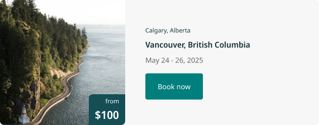
Promotional email templates bring the WestJet brand front and centre with a bright teal hero and full-width destination imagery.
The text has enough weight and contrast to stand out on the page, and most importantly, it is sparse, which allows important information such as book by dates and travel by dates to stand out.
In addition to promotional email heros, I designed four more heros types for this design system.
Simple, minimal typography
The typography components are elegant, simple and configurable in multiple arrangements. They are harmonious with all of the modular components, used across all 5 email template types.
Modular components
I simplified the workflow for email authors by creating modular components that go together, anywhere, in any email template. The dimensions, corners, typefaces and fill colours of all components are the same so they stack together elegantly.
For example, flight offer cards and hotel offer cards may have different functionality, but they look like they are part of the same family. When a guest gets different promotional emails from WestJet, the visual identity is consistent, increasing brand trust.
In addition to looking visually beautiful and consistent, creating simple components is important because (1) they render more consistently across different email clients and (2) email authors can stack components however they like, giving them more flexibility.
Celebrating airline status with tier personalization
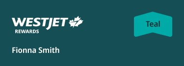
Account overview, which sits at the bottom of emails celebrates tier status, but also highlights WestJet Points balance and the member’s progress towards the next tier.
Email headers celebrate airline status by pulling in tier colours personalized to the member receiving the email.
The process
Stakeholder interviews and workshops
I kicked off the project by running stakeholder interviews and a brainstorming workshop in order to understand the varied needs of stakeholders from marketing, brand, loyalty and strategy. Referencing existing promotional and loyalty emails, we discussed what doesn’t work and what does work. Then we discussed product requirements for a new email design system, as well as wishlist items for future enhancements.
Workshopping in action! (click to enlarge)
A summary of the interviews and workshop takeaways:
Product requirements:
Components must be modular so that they can be used across different email templates
Incorporate WestJet teal for brand recognition
Lead with imagery in hero components and secondaries
Introduce stronger personalization for loyalty program members
Problems to solve:
Emails get cut off in narrow viewports
Book by dates, promo codes, and other important information is visually lost
The process
Getting inspired
Any good redesign kicks off with a competitive analysis. Here’s a snapshot of some promotional emails from my inbox that I took as visual inspiration for designing email heros.
The process
Building a foundation
Breakpoints and viewports
One of the notable problems uncovered during discovery was that emails were being horizontally cut off when viewed in desktop email clients with narrow view ports, such as Microsoft Outlook. Although there were mobile designs that would have been readable in the narrow viewport, this display glitch occurred because the emails were coded to respond to the device type, not the viewport size.
WestJet Promotional emails get cut off in small viewports - Click photo to enlarge
I solved for this problem by working with the development team to create emails that would respond to the viewport size. This way, when a desktop email client had a narrow viewport, the mobile email design would display rather than the desktop one.
To serve as the foundation of my designs, I created two master templates:
Large: >= 768 px viewports. Most desktop and tablet emails will display at this size.
Small: >=375 px viewports. All mobile emails will display at this size.
Small and large master templates
The process
Iterating again and again and again
The email design system went through three rounds of stakeholder reviews, plus many internal design reviews. Here is the highlight real of where designs started off and where they netted out.
Promotional hero component
The first iteration of the hero component failed because layering divs on top of imagery is not possible in the CMS. It also lacked brand teal and shapes, which are central to WestJet’s brand. Iteration 2 was an improvement but failed again because the copy was not accessible against the WestJet brand teal background. Additionally, layering shapes increased the workload of email authors.
In the final promotional hero component, imagery is immersive and takes over the screen, WestJet teal creates immediate brand recognition, and book by dates and promo codes are easy to find.
Promotional hero final product
Promotional hero early iteration 1
Promotional hero early iteration 2
Loyalty hero and header components
The first iteration of the loyalty hero failed because the tier colours were more prominent than WestJet master brand, which limited brand recognition. Additionally, design and loyalty took the decision to move account balance information out of the hero and into its own component.
In the final promotional hero component, the WestJet master brand teal flood the hero so that the WestJet brand stays immediately recognizable. Tier colours are brought into the hero component to celebrate tier status.
Loyalty hero final product
Loyalty hero early iteration
Account summary widget
The first iteration of the account summary widget failed because it did not incorporate enough tier colours and did not create any excitement about WestJet Rewards.
In the final account summary widget, airline status is celebrated with tier colour in a bold stroke. WestJet Points balance and tier qualifying spend are given more visual prominence with engaging iconography and a dynamic spend tracker.
The account summary widget shares a visual identity with the tier qualifying spend widget in the account web app, stringing a cohesive thread between all of WestJet’s digital products.
Account summary widget final product
Account summary widget early iteration
Tier qualifying spend widget in the WestJet account web app
Other considerations
Industry compliance
While building out a design system of components for an email-authoring CMS, I also designed with the objective of ensuring that WestJet’s promotional emails were industry compliant with one-click unsubscribe functionality. Users who no longer wish to receive promotional emails can now unsubscribe by (1) Clicking unsubscribe in the header of the email client or (2) by scrolling to the footer and clicking the second unsubscribe link.
One click unsubscribe compliance in the email client header
One click unsubscribe in the email footer
What’s next?
Looking to the future
The design system in this case study is expected to launch in February 2025.
In the next iteration of emails, I will add dark mode, in order to ensure that emails read as nicely on a dark screen as they do on a light one.

Thank you for reading!
Are you interested in working with me or just want to chat design?
Please visit my contact page and reach out!


